
Bringing in the New
Starting 2026 with an almost-completed oil painting – and an experiment in oils

Happy 2026, dear readers! First, I hope everyone has had a happy, healthy New Year, and I’m hoping that 2026 offers you much love, kindness, and the realization of dreams.
I’m one of those people who doesn’t make New Year’s resolutions. The goals I have year-after-year might change, but I often re-assess my progress throughout the year. This new year found me sequestered in my studio (my bedroom) so I could finish the mountainscape oil painting I started in 2025.
Here is my latest mountainscape oil painting with new additions to the foreground:
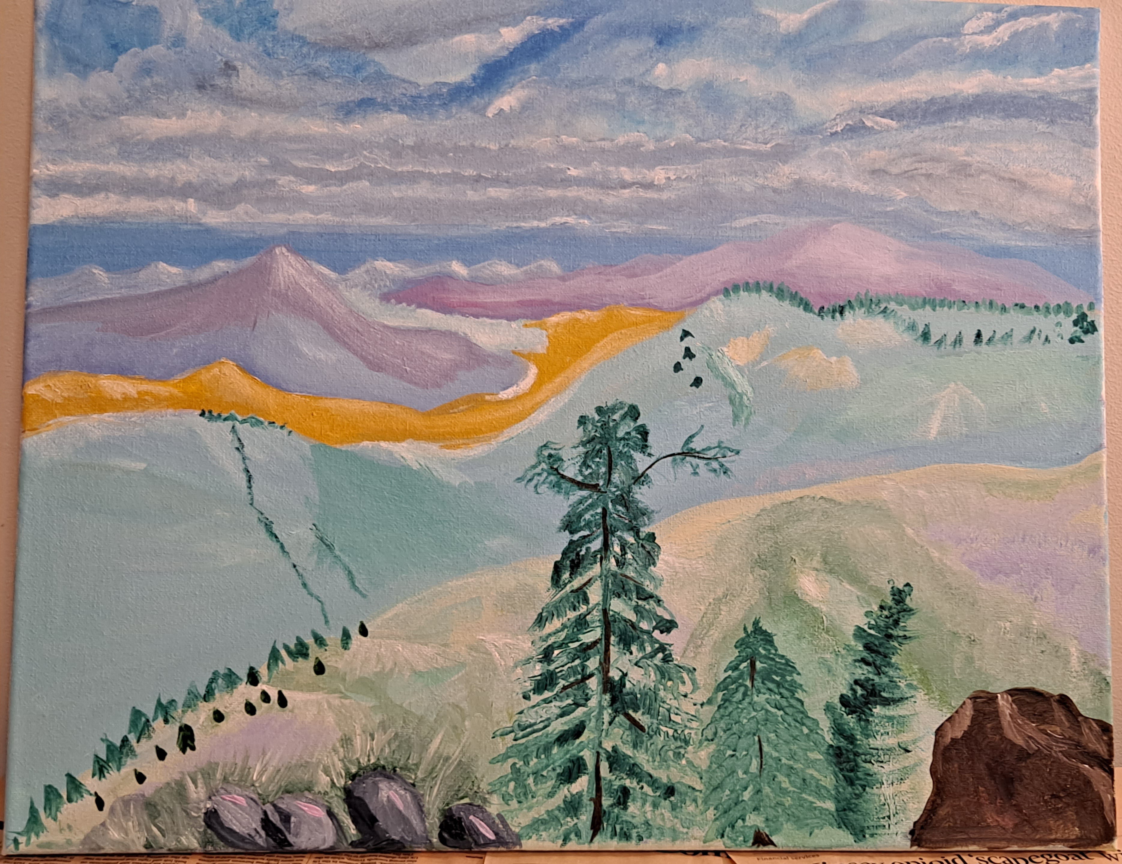
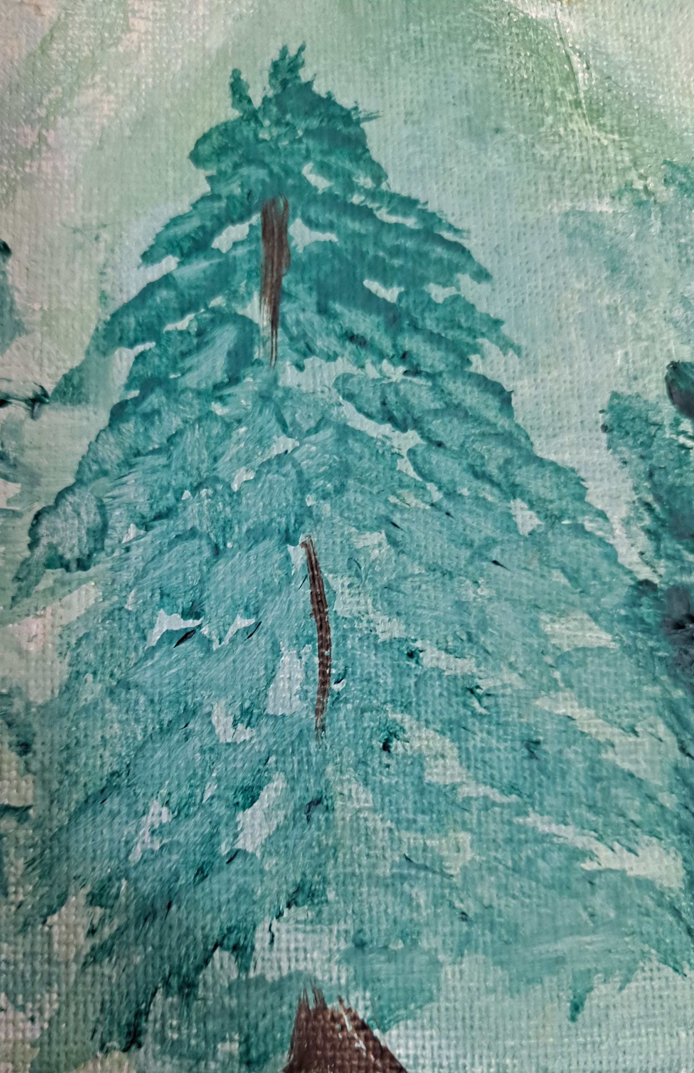
I thought this was finished, until my daughter gave it a look-over. She told me that the tallest tree looks like it is doing “the wave.” I will work just a little on this tree, probably adding more extending branches to make it seem less wavelike. My favorite tree in this artwork, however, is the deliberately crooked one to the right. The tree in the middle is unique in that I simply dabbed a pointed brush to create foliage:
As you can see, I also painted a few rocks in the foreground. The gray rocks were deliberate, but I created the large brown rock all the way at the right of the canvas to cover up what I thought was a mistake: a weird, magenta, prehistoric-looking flowering plant. I loved the color, but the plant looked strange.
Tools of the Trade
I also spent the new year learning how to use new techniques with new-to-me concepts and tools inspired by a recent Oil Painters of America webinar titled It All Starts With Shapes. Here, I watched master artist Barbara Jaenicke discuss her process for creating a landscape design for her oil compositions.
Early on, she decides which elements of a landscape to keep and which to crop out. She also identifies the shape of each landscape element. With a pencil, she does a small thumbnail sketch of the shapes on a drawing pad while estimating the value of each element. (Generally, value means the lightness or darkness of a color.) Then, on canvas, she blocks in color for the darkest areas (shapes). Jaenicke eventually puts the composition on canvas, using a paper towel to wipe away areas that will house lighter hues. She showed many of her paintings-in-process, and I was inspired to try this technique.
I chose the landscape later on in this post as a type of study. I’ve had that photo for years, but I felt that there wasn’t enough visual interest to create a painting from it (see below, under the Steps Up Close subheading).
Overall, I realized pretty quickly that cropping and designing a landscape is difficult. Most of the time, I felt I didn’t know what I was doing. I found myself using Jaenicke’s techniques but combining them with my own, often creating my own rules and painting the way I paint.
And in trying to use another artist’s techniques, I happily became aware of my own style and artistic vision. The process was challenging, but it was all so worth it.
Steps Up Close
Here are the basic steps I followed to design and create a seaside landscape, all in one sitting.
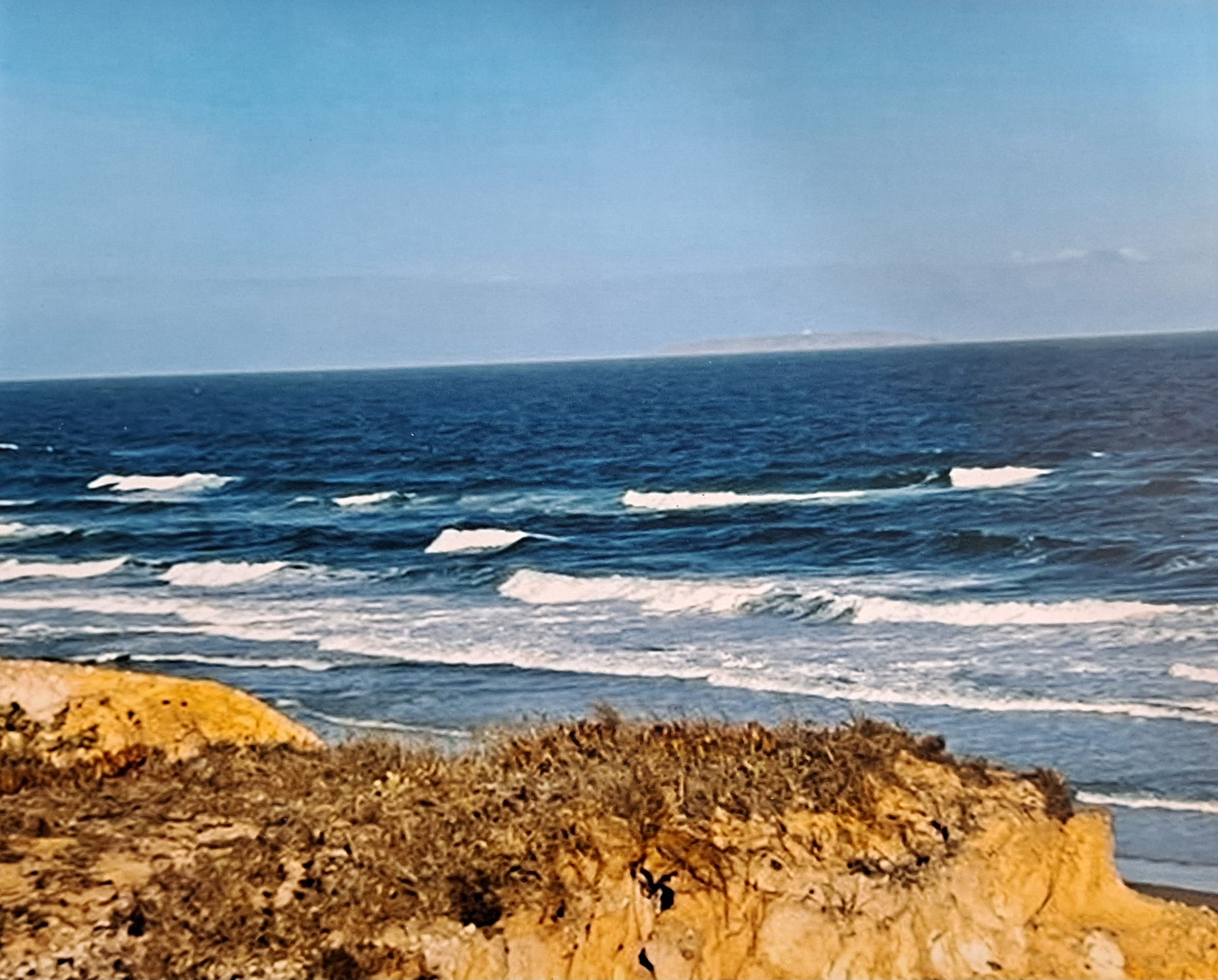
I cropped the original photo from this:
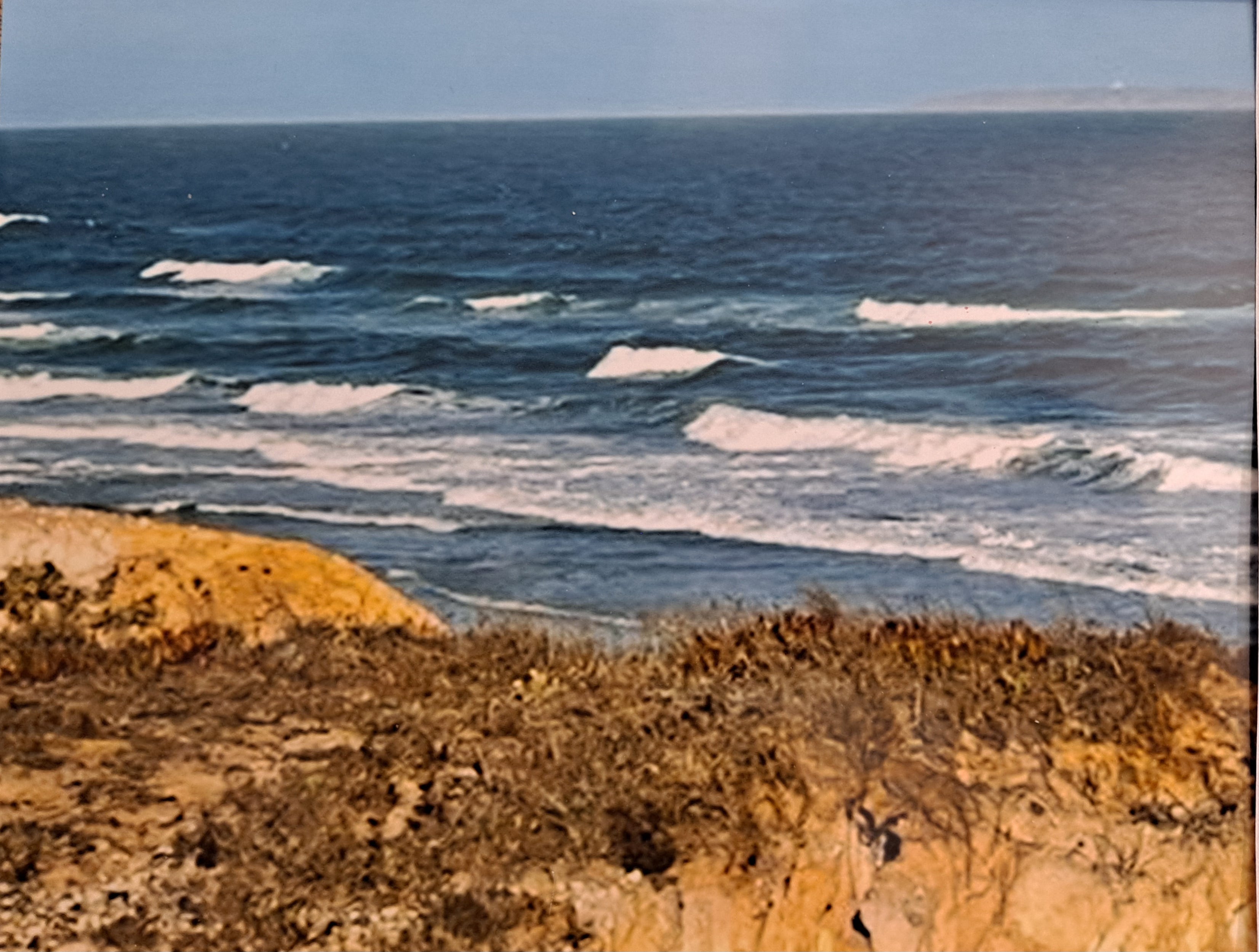
To this reference photo, as I wanted less sky, as well as less rock to the right of the painting:
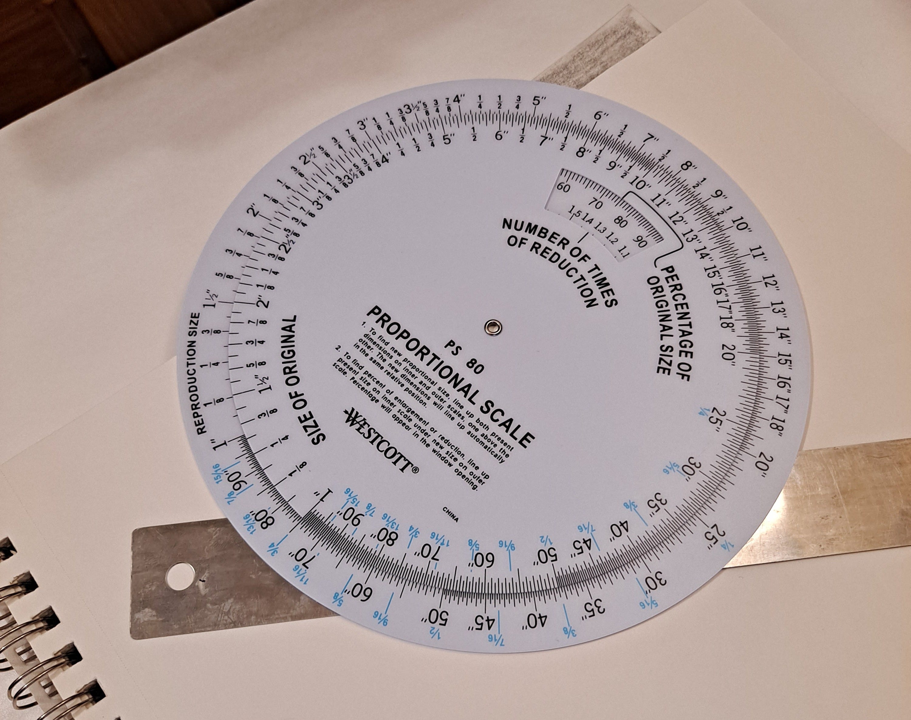
Then I used a Proportional Scale Wheel to figure out – based on the size of the canvas I was going to paint on – how large my thumbnail sketch should be, about 3” x 4.” I am not the most math-minded person, so my daughter helped me figure this out. I spent a lot of time being confused, understanding it, then being confused again:
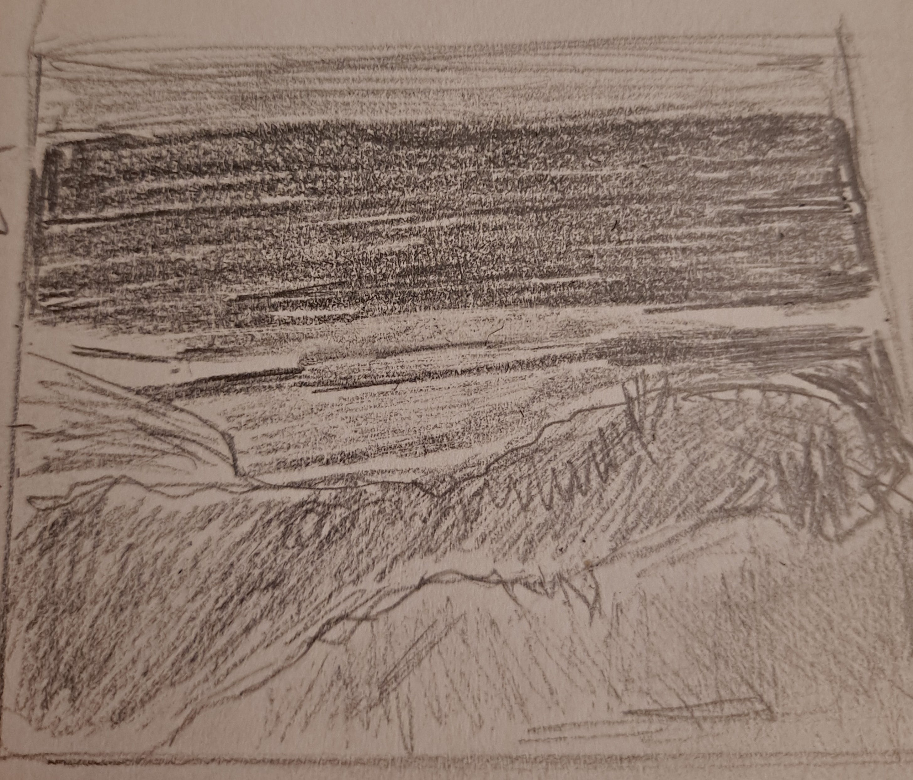
I did the thumbnail sketch with pencil, trying to see the shapes of the landscape and filling in light and dark parts of the shapes:
Then I created the colors on the canvas, wiping out with my finger in a cloth where I perceived the lighter colors would go:
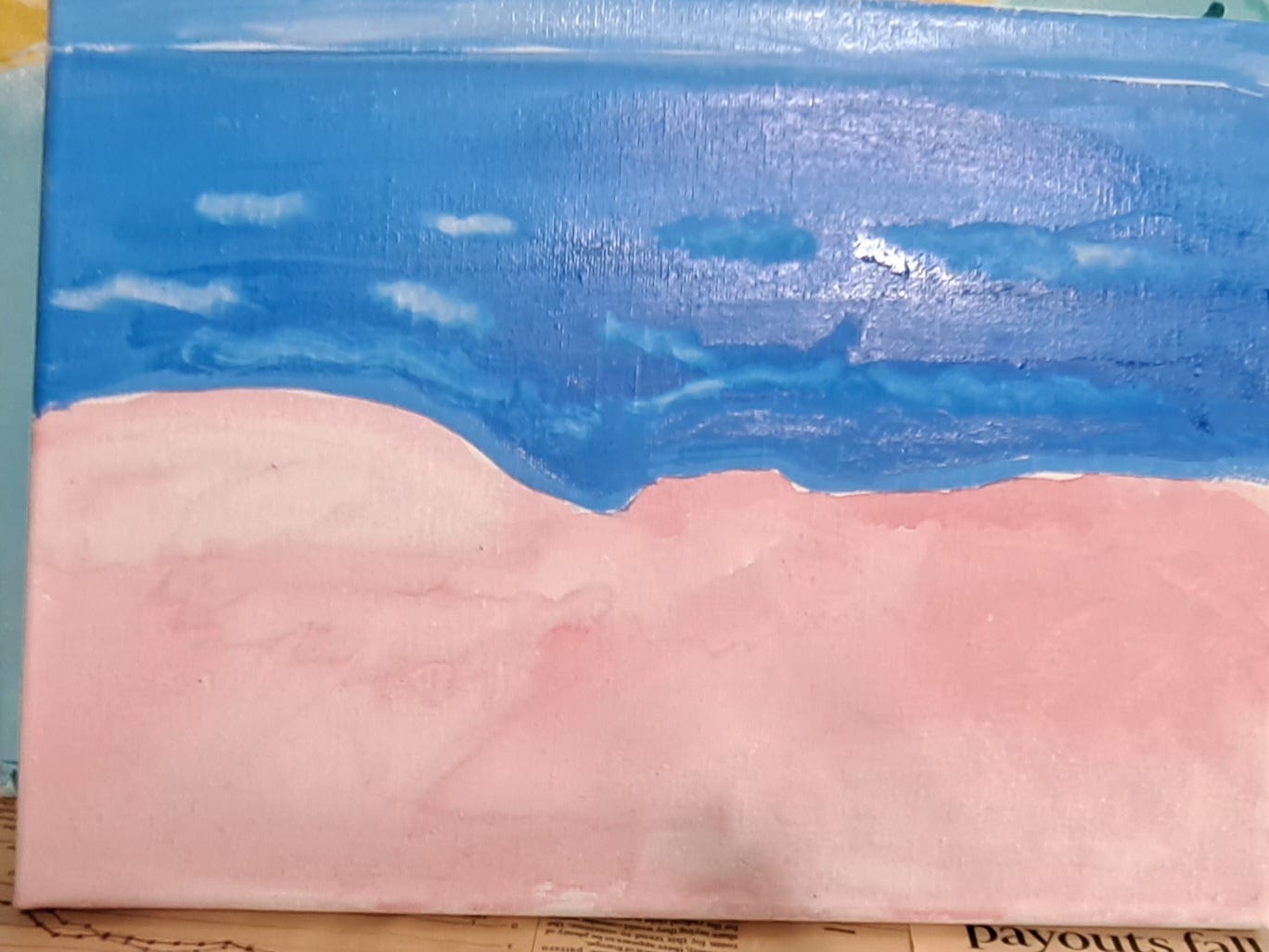
I added in the light colors, followed by a color that was darker in value than what it should’ve been. Yikes. Mistakes aplenty:
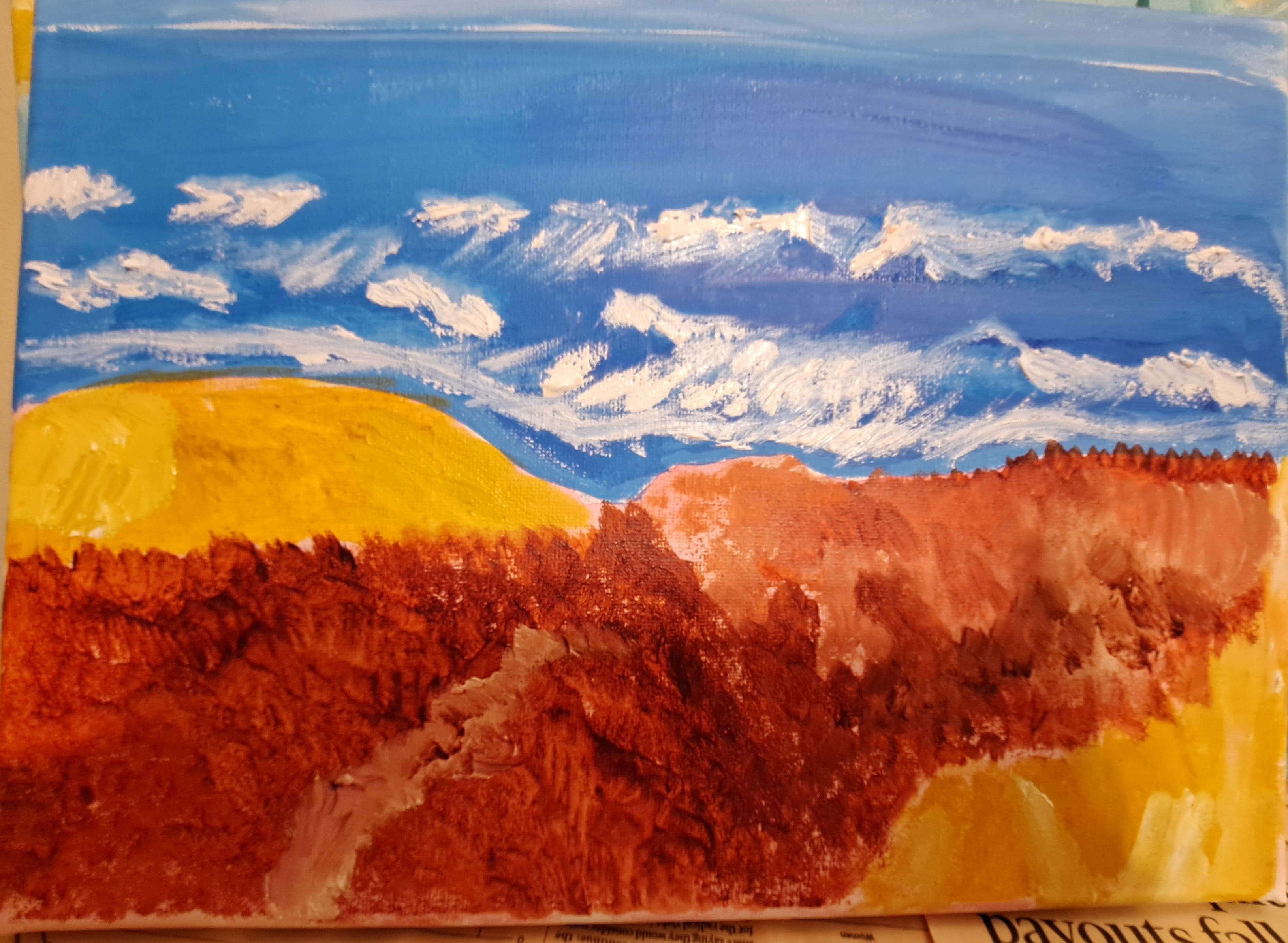
I mixed Burnt Sienna and Alizarin Crimson for that vibrant brown-red. I love, love, love this color (and plan to use it again sometime, somewhere), but in my enthusiasm, I abandoned some of the principles from the webinar. So this project kind of went awry, but I still enjoyed painting this scene and taking a unique-to-me approach.
This really came together, Beth! I really like the shading of the background colors, especially how the clouds and purple mountains appear. I can see why you like the Burnt Sienna and it really pops against the shaded yellow. Explaining the process, too really helped us to see how you got there. It seemed quite intimidating! I'm glad you stepped in and blended some of your processes as well. This was a treat to watch and so appreciate you sharing. (I would expect those trees to be waving on mountaintops!) Beautiful job and happy 2026 to you, Beth!
Hi Beth,
I love that you spent New Year's Eve/Day working on your art, and the additions you made to your mountainscape turned out so well. The trees and rocks really add a lot. My favorite part of this painting might be that brown rock. It's great that you painted it thinking you were covering up a mistake. Maybe that says something about mistakes. Or not. ha. It's interesting how you painted the foilage on the middle tree by dabbing with a paintbrush. The result turned out beautifully, I'd say.
Lucky you to have a live-in art critic! Does she listen to your advice when you critque her art? I like imagining these dialogues.
The big thing I take away from this essay is how there can be so many steps involved when creating a painting. I had no idea. I envisioned artists sitting down on in front of an empty canvas, feeling inspired, and then painting away. I'm sure this happens sometimes, but I guess not as often as I thought.
Thank you for sharing the evolution of your mountainscape as well as the steps involved with your seascape. How wonderful it must feel to bring in the new year with two new paintings.
Happy New Year, my friend. Can't wait to see where your art and writing take us in 2026. Here for all of it! xo